How to Choose the Perfect Color Palette for Your Home
How to Choose the Perfect Color Palette for Your Home
Choosing the perfect color palette for your home can feel overwhelming with endless paint swatches and design possibilities. Whether you’re planning a complete makeover or simply refreshing a single room, understanding how to create a cohesive color scheme is essential for achieving a harmonious and inviting space. The right home color palette not only reflects your personal style but also enhances your daily living experience and increases your property’s value.
Color psychology plays a crucial role in how we feel within our living spaces. Warm tones like terracotta and deep burgundy can create intimacy and comfort, while cool blues and greens promote tranquility and relaxation. Understanding these fundamentals helps you make informed decisions that go beyond mere aesthetics. The process of selecting interior colors involves balancing personal preferences with design principles, natural lighting conditions, and the functional needs of each space.
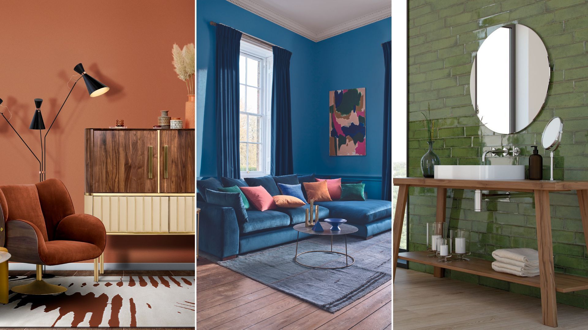
Current color trends 2025 are embracing dark tones like deep chocolatey browns, vibrant burgundies, and shadowy olive greens to create an ambiance of opulence and refined elegance, with rich hues of ebony and black olive used as accents within a room to ground a brighter and lighter palette. Benjamin Moore’s Color of the Year 2025, Cinnamon Slate 2113-40, embraces the beauty of quietly colorful hues, while HGTV Home by Sherwin-Williams launched a color palette for 2025 called Naturally Refined, spanning 10 hues inspired by a slow and sustainable pace to life, with neutral and earthy tones.
Creating a successful whole-house color palette requires strategic planning and attention to flow between rooms. Professional designers recommend working with three to five main colors throughout your home, ensuring visual continuity while allowing for individual room personalities. This comprehensive guide will walk you through every aspect of choosing colors for home interiors, from understanding color theory basics to implementing the latest design trends, helping you create spaces that are both beautiful and personally meaningful.
Understanding Color Theory Fundamentals
Color theory forms the foundation of successful interior design color schemes. The color wheel consists of primary colors (red, blue, yellow), secondary colors (green, orange, purple), and tertiary colors created by mixing adjacent hues. Understanding these relationships helps you create harmonious color combinations that feel intentional and sophisticated.
Complementary colors sit opposite each other on the color wheel and create dynamic contrast when used together. For example, pairing deep navy with warm orange accents creates visual interest without overwhelming the space. Analogous colors, found adjacent to each other on the wheel, offer a more subtle and cohesive approach. Think of ocean-inspired palettes combining various blues and greens for a naturally harmonious feel.
Triadic color schemes use three colors equally spaced on the color wheel, providing vibrant yet balanced combinations. However, in residential design, it’s often best to let one color dominate while using the others as accents. The monochromatic approach uses various shades, tints, and tones of a single color family, creating sophisticated depth through subtle variations rather than contrasting hues.


Temperature plays a crucial role in color selection. Warm colors (reds, oranges, yellows) advance visually and make spaces feel cozy but smaller. Cool colors (blues, greens, purples) recede and can make rooms appear larger and more serene. Understanding these properties helps you manipulate the perceived size and mood of your spaces through strategic paint color choices.
Assessing Your Space and Lifestyle Needs
Before diving into specific color palettes, evaluate your home’s unique characteristics and your family’s lifestyle requirements. Consider the architectural style of your home – a mid-century modern ranch might suit different interior color schemes than a traditional Victorian. Existing elements like flooring, cabinetry, and built-ins will influence your color selection and should be incorporated into your planning process.
The room’s function significantly impacts appropriate color choices. Bedrooms benefit from calming, restful hues that promote good sleep, while home offices might need energizing colors that enhance focus and productivity. Kitchens and dining areas can handle warmer, more stimulating colors that encourage social interaction and appetite, whereas bathrooms might benefit from spa-like, refreshing tones.
Family lifestyle considerations include the presence of children, pets, and entertainment patterns. Families with young children might prioritize washable paint finishes and forgiving colors that hide wear and tear. If you frequently entertain, consider how your color palette will photograph and how it makes guests feel. Active households might benefit from energizing colors, while those seeking tranquility might prefer more muted, calming tones.
Traffic flow through your home affects color continuity. Consider the whole property and how rooms flow into one another. Which areas can you see through an open door or along a hallway, and create a color scheme that feels considered and coherent? Open floor plans require especially careful planning to ensure color harmony across visible sight lines.
Working with Natural and Artificial Lighting
Lighting dramatically affects how colors appear in your space, making this one of the most critical factors in color selection. When choosing your color palette, remember that lighting will change the way specific colors look and feel. For example, if you prefer warm lighting, your wall paint color will likely look more yellow and mellow. Understanding these effects prevents costly mistakes and ensures your color palette looks intentional throughout the day.
North-facing rooms receive cool, indirect light that can make colors appear more muted and gray. Warm colors help counteract this effect, while cool colors might appear too cold and uninviting. South-facing rooms receive warm, direct sunlight that intensifies colors and can make cool tones appear more vibrant while potentially washing out warm tones during peak daylight hours.
East-facing rooms enjoy warm morning light that gradually shifts to cooler afternoon light, affecting how your color choices appear throughout the day. West-facing rooms experience the opposite pattern, with cool morning light transforming to warm, golden evening light that can dramatically alter color perception.
Artificial lighting choices significantly impact your color palette’s appearance. LED bulbs with different color temperatures (measured in Kelvins) can make the same paint color appear dramatically different. Warm white LEDs (2700K-3000K) enhance warm colors and create cozy atmospheres, while cool white LEDs (4000K-5000K) make cool colors more vibrant but can make warm tones appear flat.
The 60-30-10 Rule for Color Distribution
The 60-30-10 rule is a proven formula for creating balanced color schemes that feel professionally designed. When decorating a space, divide the colors into components of 60 percent of a dominant color (walls), 30 percent of a secondary color (upholstery), and 10 percent of an accent color (accessories). This proportion creates visual hierarchy and prevents any single color from overwhelming the space.
The dominant color (60%) typically appears on walls, large furniture pieces, or flooring. This should be a color you can live with long-term, as it forms the backdrop for your entire space. Neutral colors often work best for this dominant role, providing flexibility for changing accent colors over time. However, bold color lovers can choose more saturated hues for their dominant color with careful planning.
The secondary color (30%) appears in upholstery, window treatments, area rugs, and medium-sized furniture pieces. This color should complement your dominant color while adding visual interest. It might be a deeper or lighter version of your dominant color, or it could introduce a new hue that creates intentional contrast.
The accent color (10%) appears in accessories, throw pillows, artwork, and decorative objects. This is where you can introduce bold, trendy colors without major commitment. Color trends in 2024 highlight a fresh, new mood — that of being bold and confident with your choices. Gone are the days of soft, light palettes that created ‘safe’ looking interiors. Your accent color can reflect current color trends and be easily changed as your preferences evolve.
Creating Flow Throughout Your Home
Whole-house color schemes require careful planning to achieve visual continuity while allowing individual rooms to have distinct personalities. Ideally, a whole house color palette should have six or seven hues, including a dominant color, a few secondary colors, a trim color, and an accent color. This limited palette ensures cohesion while providing enough variety to keep your home visually interesting.
Color transitions between rooms can be achieved through several techniques. You might use lighter or darker versions of the same color family, or introduce new colors through shared undertones. For example, a warm gray living room might transition to a sage green dining room if both colors share warm undertones. Trim colors provide another opportunity to create unity – using the same trim color throughout your home creates subtle continuity.
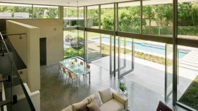
Open floor plans present unique challenges for color flow. Since multiple functional areas are visible simultaneously, your color palette must work harmoniously across cooking, dining, and living spaces. Consider using your dominant neutral on the largest wall surfaces, then introducing secondary and accent colors through furniture, rugs, and accessories to define different zones within the open space.
Hallways and transitional spaces offer opportunities to bridge different color schemes between rooms. These areas can feature colors that contain elements from both adjacent rooms, creating smooth visual transitions. Out of the three to five main colors in your interior paint color scheme, at least one should be neutral, one should be white, and one should be a darker, contrasting color.
Room-Specific Color Considerations
Each room in your home serves different functions and benefits from tailored color approaches. Living rooms are social spaces where warm, inviting colors encourage conversation and relaxation. Consider the room’s size – lighter colors can make small living rooms feel more spacious, while larger rooms can handle deeper, more dramatic hues. Current trends favor rich, sophisticated colors that create cozy, intimate atmospheres perfect for gathering.
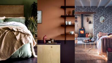
Bedrooms should promote rest through calming color palettes. Cool blues, soft greens, and muted purples create tranquil environments conducive to sleep. However, personal preference matters most in these private spaces – if warm colors make you feel comfortable and secure, they can work beautifully in bedrooms. Consider the room’s exposure to natural light when making bedroom color choices.
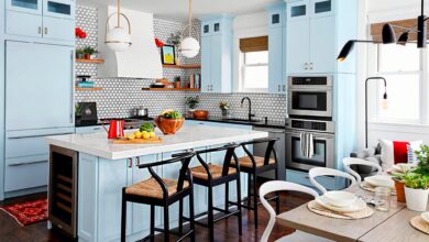
Kitchen color schemes must balance functionality with style. Lighter colors help small kitchens feel more open, while darker colors can add sophistication to larger spaces. Consider how colors will look under task lighting and whether they’ll complement your countertops, backsplash, and appliances. Current kitchen color trends include rich, earthy tones paired with natural materials for a grounded, organic feel.
Bathroom color palettes can range from spa-like serenity to bold, energizing statements. Consider the size of your bathroom – small powder rooms can handle bold, dramatic colors that might overwhelm larger spaces. Moisture resistance is crucial, so choose high-quality paints formulated for bathroom environments. Natural light availability significantly impacts bathroom color choices.
Current Color Trends and Timeless Choices
Staying informed about current color trends while making timeless choices requires balancing contemporary style with lasting appeal. Expect to see rich hues of ebony and black olive used as accents within a room to ground a brighter and lighter palette. These rich tones carry depth that elevates a space with a sense of elegance and polish. However, incorporating trends through easily changeable elements like accessories and textiles allows you to stay current without major renovations.
Timeless color palettes typically center around neutral foundations with carefully chosen accent colors. Classic combinations like navy and white, sage green and cream, or warm gray and soft gold have remained popular across decades. These color schemes provide sophisticated backdrops that accommodate changing design trends through accessories, artwork, and decorative elements.
Earthy color palettes are gaining significant popularity in 2025, reflecting a desire for connection with nature and sustainable living. This color palette is inspired by a slow and sustainable pace to life, with neutral and earthy tones. These natural color schemes include warm terracottas, sage greens, and rich browns that create grounding, comfortable environments.
Bold accent colors allow you to incorporate trends without overwhelming commitment. Current favorites include deep burgundy, forest green, and rich navy – colors substantial enough to make statements while remaining sophisticated. These can be introduced through furniture, artwork, or feature walls while maintaining neutral foundations for long-term flexibility.
Testing and Finalizing Your Color Choices
Color testing is essential before committing to your final paint colors. Purchase small sample sizes and paint large swatches (at least 2×2 feet) on different walls within each room. Observe these samples at various times of day and under different lighting conditions to understand how the colors will actually appear in your space. This investment in color samples prevents costly mistakes and ensures satisfaction with your final choices.
Digital tools and apps can help visualize color combinations, but remember that screens display colors differently from paint on walls. Use these tools for initial exploration, but always confirm choices with physical samples. Many paint manufacturers offer virtual color consultation services that can provide professional guidance for your specific space and needs.
Color matching existing elements in your home requires careful attention to undertones. Bring fabric samples, flooring pieces, or photos of fixed elements when selecting paint colors. Professional color consultants can help identify undertones and suggest color palettes that harmonize with your existing finishes and furnishings.
Final color decisions should consider long-term livability alongside immediate appeal. While bold, trendy colors might look stunning in photos, consider whether you’ll enjoy living with them daily for several years. Quality paint makes a significant difference in color richness and durability – investing in premium paint brands ensures your carefully chosen color palette looks its best for years to come.
Professional Tips for Color Success
Professional designers employ specific strategies to ensure color palette success. Working with 3 to 5 colors is a good amount to keep things interesting and coherent in a room. Less than 3 can feel a little matchy-matchy, while more than 5 can be overwhelming. This guideline helps create sophisticated color schemes that feel intentional and well-planned.
Layering colors through various finishes and textures adds depth and interest to your color palette. Matte, satin, and semi-gloss finishes of the same color can create subtle variation and visual texture. Incorporating color through different materials – paint, textiles, natural wood, metals, and stone – creates rich, multidimensional spaces that feel professionally designed.
Color placement throughout your room affects the overall balance and flow. Distribute your accent colors in odd numbers (groups of three or five) and at different heights throughout the space. This creates visual movement and prevents colors from appearing spotty or unintentional. Consider the visual weight of colors – darker colors appear heavier and should be balanced thoughtfully throughout the room.
Seasonal adaptability in your color scheme allows your home to feel fresh throughout the year. Choose a neutral foundation that works in all seasons, then swap seasonal accessories to reflect changing moods. Summer might call for lighter, brighter accents, while winter might embrace richer, warmer tones. This approach keeps your home color palette feeling dynamic and responsive to natural rhythms.
More Read: Best Color Palettes for Every Room in 2025
Conclusion
Creating the perfect color palette for your home involves balancing personal preferences with design principles, current trends with timeless appeal, and individual room needs with whole-house continuity. By understanding color theory fundamentals, assessing your space and lifestyle requirements, working with lighting conditions, and applying proven distribution rules like the 60-30-10 formula, you can confidently create color schemes that enhance your daily living experience.
Remember that successful interior color selection is a process that benefits from careful planning, proper testing, and attention to both functional and aesthetic considerations. Whether you embrace current trends like rich, earthy tones and sophisticated dark accents or prefer timeless neutral foundations with carefully chosen color highlights, the key is creating spaces that reflect your personality while providing comfort and visual harmony for years to come.