Best Color Palettes for Every Room in 2025
This comprehensive guide explores the best color palettes for every room in 2025. By understanding current trends and the psychological effects of color.
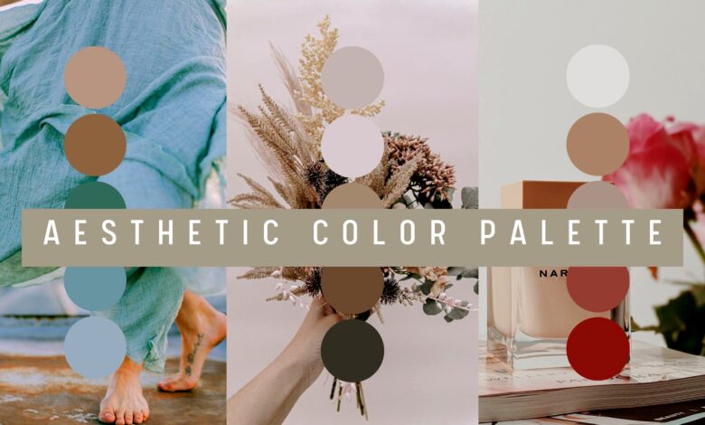
When it comes to creating the perfect ambiance in your home, few elements are as impactful as your choice of color palettes. In 2025, interior design is taking a bold yet mindful turn, emphasizing balance, nature-inspired tones, and rich, expressive hues. Whether you’re renovating a cozy apartment or styling a spacious house, selecting the right color palette for each room is essential for achieving both functionality and beauty.
This comprehensive guide explores the best color palettes for every room in 2025. By understanding current trends and the psychological effects of color, you can create spaces that reflect your personal style while enhancing your living experience.
1. The Psychology Behind Color Palettes
Before diving into room-specific suggestions, it’s essential to understand why color palettes matter. Colors influence mood, energy levels, and even productivity. In 2025, designers are leaning into this psychology, crafting palettes that not only look stunning but also support mental and emotional well-being.
- Warm colors like reds, oranges, and yellows tend to energize and stimulate.
- Cool colors such as blues, greens, and purples often calm and relax.
- Neutral tones like greys, taupes, and beiges ground a space and make it feel balanced.
The ideal color palette combines these elements in a way that suits the purpose and personality of each room.
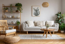
2. Living Room Color Palettes 2025: Comfort Meets Sophistication
The living room is the heart of the home, and in 2025, it’s all about combining coziness with elegance. Color palettes for living rooms are leaning toward earthy sophistication.
- Top Picks: Olive green, terracotta, clay, soft grey, and ivory.
- Trend Highlight: The rise of biophilic design makes nature-inspired tones the top choice.
- Why It Works: These hues create a grounded, warm environment perfect for socializing or relaxing.
Accent colors like muted gold or navy can be used for throw pillows, rugs, and artwork to add depth without overwhelming the primary color palette.
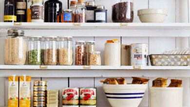
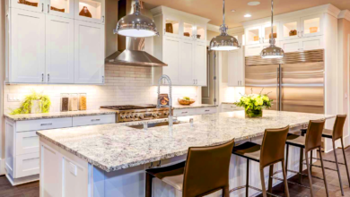
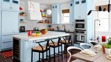
3. Kitchen Color Palettes 2025: Fresh and Functional
Kitchens in 2025 are becoming more than just cooking spaces. They are hubs of creativity, family bonding, and wellness. This transformation is reflected in the trending color palettes.
- Top Picks: Sage green, off-white, warm wood tones, matte black, and stainless steel.
- Trend Highlight: Scandinavian minimalism meets Mediterranean charm.
- Why It Works: These palettes offer a clean look while remaining inviting and timeless.
Consider two-tone cabinets using contrasting color palettes, such as sage on the bottom and cream on top, to add visual interest and sophistication.
4. Bedroom Color Palettes 2025: Tranquil Retreats
Your bedroom should be a sanctuary, and color palettes in 2025 are designed with serenity in mind. Think soft, cocooning shades that help decompress after a long day.
- Top Picks: Lavender, dusty rose, misty blue, mushroom beige, and snow white.
- Trend Highlight: Wellness-focused hues that promote restful sleep.
- Why It Works: These color palettes reduce stress and encourage relaxation.
Layer different tones of the same color family—like pale mauve with deeper plum accents—for a cozy, layered effect.
5. Bathroom Color Palettes 2025: Spa-Like Serenity
Bathrooms are no longer just utilitarian; they are turning into spa-like sanctuaries. The best color palettes in 2025 focus on calm and cleanliness with a hint of luxury.
- Top Picks: Seafoam green, sandy beige, cloud white, charcoal, and blush.
- Trend Highlight: Monochromatic themes with textural contrasts.
- Why It Works: These shades create a serene environment that feels both fresh and indulgent.
Introduce metallic fixtures in gold or brass to complement these color palettes for a high-end finish.
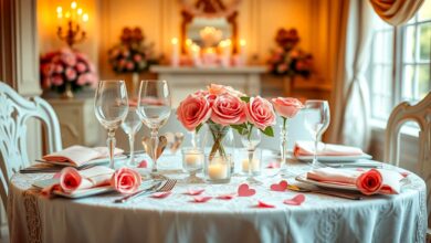
6. Dining Room Color Palettes 2025: Elevated Gatherings
Dining rooms are experiencing a revival, with more families prioritizing shared meals. The color palettes reflect a mood of elevated intimacy.
- Top Picks: Deep burgundy, forest green, champagne, slate grey, and amber.
- Trend Highlight: Moody, dramatic tones paired with soft neutrals.
- Why It Works: These hues stimulate appetite and conversation while creating an elegant setting.
Use accent lighting to highlight artwork or a feature wall that uses a darker shade from the chosen color palette.
7. Home Office Color Palettes 2025: Productivity and Peace
As remote work continues to grow, the home office has become a vital part of modern living. The best color palettes for 2025 balance energy with calm.
- Top Picks: Teal, charcoal, soft beige, mustard, and pale mint.
- Trend Highlight: Dual-purpose designs with adaptable color schemes.
- Why It Works: These palettes enhance concentration while making the space feel personal and inspiring.
Color zoning—using different shades to define areas for work, reading, or brainstorming—is an effective way to maximize small office spaces.
8. Kids’ Room Color Palettes 2025: Playful and Practical
Children’s rooms need to support play, creativity, and rest. In 2025, color palettes for kids are more nuanced, moving away from overly bright primaries.
- Top Picks: Butter yellow, muted aqua, coral, light lilac, and soft tan.
- Trend Highlight: Gender-neutral and adaptable themes.
- Why It Works: These hues are cheerful yet calming, ideal for multifunctional use.
Use wall decals or murals to integrate bold patterns without disturbing the core color palette.
9. Entryway Color Palettes 2025: First Impressions Matter
The entryway sets the tone for the entire home. In 2025, designers are focusing on welcoming yet stylish color palettes.
- Top Picks: Charcoal, ivory, moss green, warm taupe, and dusty blue.
- Trend Highlight: Dramatic tones that don’t overwhelm.
- Why It Works: These color palettes convey warmth and sophistication at first glance.
Consider a two-tone wall design or statement wallpaper that complements the rest of your home’s palette.
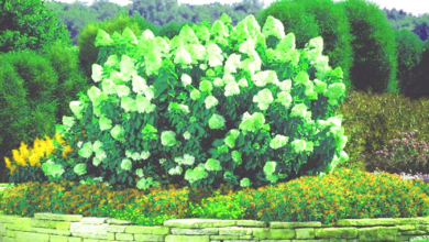
10. Outdoor Spaces Color Palettes 2025: Extending Interior Style
Outdoor living areas are now essential parts of the home, especially in moderate climates. Color palettes here should seamlessly transition from indoors to outdoors.
- Top Picks: Terracotta, sage green, navy, sandstone, and crisp white.
- Trend Highlight: Earthy tones with vibrant accents.
- Why It Works: These colors blend well with natural surroundings while providing comfort and style.
Add textiles like cushions and rugs in accent hues to create a cohesive yet dynamic palette.
11. Ceiling and Trim Color Palettes 2025: Finishing Touches
While often overlooked, ceilings and trims play a vital role in the overall aesthetic. Color palettes in 2025 recommend bold or subtle contrasts.
- Top Picks: Pale blush, soft blue-grey, crisp white, graphite, and champagne gold.
- Trend Highlight: Painted ceilings and colored trims as focal features.
- Why It Works: These elements tie the whole room together and add unexpected charm.
Use a slightly darker or lighter shade from your wall palette to highlight architectural features.
Conclusion: Crafting Harmonious Spaces with Thoughtful Color Palettes
In 2025, color palettes are more than just aesthetic choices—they are tools for well-being, productivity, and self-expression. By understanding the emotional and practical impacts of color, homeowners can create harmonious, functional, and beautiful environments in every room.
Whether you’re embracing soft neutrals in the bedroom, rich tones in the dining room, or calming greens in the kitchen, the key is consistency and personal resonance. Use these 2025 color palettes as a starting point and adapt them to reflect your unique style and needs.