How to Mix Colors and Patterns Without Overdoing It
A clear, practical guide on how to mix colors and patterns without overdoing it, covering ratios, scale, and common mistakes to avoid.
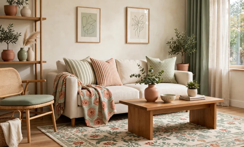
How to Mix Colors and Patterns Without Overdoing It: 7 Foolproof Rules for a Beautiful Home
There’s a specific kind of confidence in a room that mixes colors and patterns well. It doesn’t look accidental, and it definitely doesn’t look matchy. It looks like someone made deliberate choices and trusted their eye. Then there’s the other version, the room where a floral sofa, striped rug, and patterned wallpaper are all fighting for attention, and nothing quite lands.
The gap between those two outcomes usually isn’t talent. It’s a handful of practical rules that most confident decorators are using instinctively, even if they’ve never written them down. Learning how to mix colors and patterns without overdoing it really comes down to understanding scale, repetition, and restraint, three things that are easy to explain but take a bit of practice to apply well in your own space.
In this article, we’ll break down exactly how to approach color and pattern mixing with more confidence and less guesswork. We’ll cover foundational color theory you can actually use, the classic ratio designers rely on to keep a room balanced, how to mix pattern scale so nothing competes for attention, and the most common mistakes that turn a bold room into a chaotic one. Whether you’re refreshing a single room or planning an entire home, these principles will give you a genuinely reliable framework, so your color and pattern choices feel intentional rather than random.
Start With a Basic Understanding of Color Theory
Before mixing anything, it helps to understand a few fundamentals of how colors relate to each other. You don’t need a design degree, just enough working knowledge to make confident choices.
The Color Wheel Basics
Most successful color pairings fall into one of a few relationships on the color wheel:
- Complementary colors sit opposite each other (like blue and orange) and create strong, high-contrast pairings
- Analogous colors sit next to each other (like blue, teal, and green) and create a softer, more cohesive look
- Monochromatic schemes use different shades and tones of a single color for a calm, unified feel
- Triadic schemes use three colors evenly spaced on the wheel for a balanced but vibrant combination
Tools like Adobe Color let you experiment with these relationships visually and generate palettes based on a single starting shade, which is a genuinely useful way to test combinations before committing to paint or fabric.
Warm vs Cool Undertones
One of the most common reasons a color combination feels “off” without an obvious explanation is a clash between warm and cool undertones. A warm beige next to a cool grey can look muddy together, even though both are technically neutral. When mixing colors and patterns, checking that your neutrals share a similar undertone is a small step that prevents a lot of frustration later.


Use the 60-30-10 Rule as Your Foundation
This is probably the single most useful rule in this entire article, and it’s the one professional decorators lean on constantly. It gives you a ratio to follow so your room feels balanced rather than chaotic.
- 60% dominant color — usually your walls, large furniture, or flooring
- 30% secondary color — often curtains, an accent chair, or a rug
- 10% accent color — the boldest, most saturated color, used in cushions, artwork, or small decorative objects
This structure works because it gives your eye a clear hierarchy. Without it, rooms tend to feel like every color is competing for the same amount of attention, which is exhausting to look at even if each individual color is genuinely nice on its own.
Applying the Ratio to Patterns Too
The same logic extends naturally to pattern mixing. Your dominant pattern (if you use one at all) should take up the most visual space, with secondary and accent patterns layered in smaller doses through cushions, throws, or smaller furniture pieces.
Master Pattern Scale Before Anything Else
If there’s one skill that separates a well-mixed pattern scheme from a cluttered one, it’s understanding scale. How to mix colors and patterns without overdoing it really hinges on this single principle more than any other.
The Large, Medium, Small Formula
- One large-scale pattern — think a big floral, a bold geometric rug, or oversized stripes
- One medium-scale pattern — a smaller check, a mid-sized print, or a textured weave
- One small-scale pattern — a fine stripe, a tiny dot, or a subtle texture
When patterns are mixed at different scales, your eye can process each one individually instead of everything blurring together into visual noise. Using three patterns of similar scale is one of the fastest ways to make a room feel busy rather than curated.
Let Solids Do the Resting Work
Patterns need breathing room. A room with three bold patterns and nothing else will almost always feel overwhelming, no matter how well the colors coordinate. Solid-colored furniture, walls, or flooring gives the eye somewhere to rest between patterned elements, which is what makes a heavily patterned room feel intentional instead of chaotic.
Find a Unifying Color Thread
Even wildly different patterns, florals, stripes, geometrics, can work together in the same room if they share at least one common color. This single tip solves more pattern-mixing problems than almost anything else.
- Pick one color that appears in every pattern you’re using, even as a minor accent
- Use that shared color to tie together patterns that otherwise have nothing in common stylistically
- Repeat the unifying color at least three times around the room for genuine cohesion, not just once
For example, a floral cushion, a striped rug, and a geometric throw can all coexist beautifully if each one contains a hint of the same terracotta or navy tone somewhere in its design.
Test Combinations Before Committing
Confidence with color and pattern mixing comes from practice, but you can shortcut a lot of trial and error by testing combinations properly before buying anything permanent.
- Gather physical swatches of paint, fabric, and flooring samples rather than relying on screen colors, which shift significantly depending on your device
- Lay swatches next to each other in the actual room, at different times of day, since natural light changes how colors and patterns read
- Start small with cushions and throws before committing to large patterned furniture or wallpaper
- Photograph your combinations and review them later, since a photo often reveals clashes your eye adjusts to in person
Paint and design resources like Pantone offer curated seasonal color palettes and pairing guidance that can be a helpful starting point if you’re feeling stuck on where to begin.
Common Mistakes That Make a Room Feel Overdone
Knowing what not to do is just as useful as knowing the rules to follow. These are the mistakes that most often tip a well-intentioned room into looking cluttered or chaotic.
Using Too Many Competing Focal Points
A room needs one clear focal point, whether that’s a statement wallpaper, a bold rug, or a striking piece of furniture. When several elements are all trying to be the star of the room, none of them get to shine, and the space feels visually noisy.
Ignoring Undertones
As mentioned earlier, warm and cool undertones clashing is one of the most common, and most fixable, mistakes. Always check undertones side by side in natural light before finalizing a combination.
Mixing Patterns of the Same Scale
Two florals of similar size, or two geometric prints with matching proportions, tend to compete rather than complement each other. Varying scale, as covered above, solves this almost every time.
Skipping Neutral Ground
Even the boldest, most pattern-heavy rooms need some neutral space, whether that’s flooring, wall color, or a plain sofa. Without it, there’s no visual pause, and the whole room can start to feel exhausting rather than energizing.
Forcing Too Many Colors Into One Room
A workable palette for most rooms includes one dominant color, one or two supporting colors, and a single accent. Beyond that, it becomes genuinely difficult to keep a room feeling cohesive, no matter how skilled the execution.
Applying These Rules Room by Room
Different rooms can handle different levels of boldness, and it helps to calibrate your approach based on how the space is actually used.
- Living rooms: a good place for a bolder mix, since these are spaces for gathering and personality, layer two to three patterns using the scale rule above
- Bedrooms: lean toward a calmer palette with softer pattern mixing, since this is a space meant for rest
- Kitchens and dining rooms: bold color works well here, but keep pattern mixing simpler, one or two patterns max, since these spaces already have a lot of visual texture from cabinetry and appliances
- Hallways and entryways: a great spot to experiment with a bold wallpaper or pattern, since you pass through rather than spend extended time in the space
A Simple Checklist Before You Commit
Before finalizing any color and pattern scheme, run through this quick checklist:
- Does one color or pattern clearly dominate, following roughly the 60-30-10 ratio?
- Are your patterns mixed across at least two different scales?
- Is there a unifying color thread running through every patterned element?
- Have you tested combinations in the room’s actual natural light?
- Is there enough solid, neutral space for the eye to rest?
If you can answer yes to all five, you’re very likely looking at a scheme that will read as confident and intentional rather than overdone.
Conclusion
Learning how to mix colors and patterns without overdoing it comes down to a handful of reliable principles rather than natural talent alone: understanding basic color relationships, following a ratio like 60-30-10 to keep your palette balanced, varying pattern scale so elements don’t compete, and finding a unifying color thread to tie everything together. Testing combinations before committing, and knowing the common mistakes to avoid, like matching undertones or skipping neutral space, rounds out a genuinely reliable framework. With these rules in hand, mixing bold colors and patterns stops feeling like a gamble and starts feeling like a skill you can apply confidently in any room.