15 Living Room Color Schemes That Never Go Out of Style
Living room color schemes that stay stylish for years, warm neutrals, classic blues, and earthy pairings that never feel dated.
15 Living Room Color Schemes That Never Go Out of Style
Living room color schemes come and go with the seasons, one year it’s all about greige, the next it’s terracotta or sage green, but a handful of combinations have stuck around for decades and show no sign of fading. These are the palettes designers return to again and again, not because they’re trendy, but because they work. They flatter natural light, pair easily with wood tones and metals, and don’t box you into a single decor style you’ll outgrow in a few years.
If you’ve ever repainted a room only to feel tired of it eighteen months later, the problem usually isn’t the color itself. It’s that the color was chosen for a moment rather than for the long haul. A truly timeless scheme holds up through changing throw pillows, new furniture, and even a full redecorate, because the underlying palette is flexible enough to grow with you.
This guide walks through 15 living room color schemes that have proven their staying power, from classic neutrals to bolder combinations that still read as sophisticated rather than dated. Each one includes practical guidance on undertones, accent pairings, and the kind of room it suits best, so you can pick a direction with confidence instead of guessing. Whether you’re painting for the first time or replacing a color you’ve grown tired of, these combinations are built to last.
Why Timeless Living Room Color Schemes Matter
Repainting a living room takes time, money, and effort, so getting the color right the first time matters more here than in almost any other room. A well-chosen scheme:
- Holds its value. Neutral and classic living room color schemes tend to appeal to a wider range of buyers if you ever sell your home.
- Adapts to changing decor. A flexible base palette lets you swap furniture, art, and accessories without a full repaint.
- Works with natural light. Timeless colors tend to look good in both warm afternoon light and cooler morning light, rather than shifting dramatically throughout the day.
- Ages gracefully. Trend-driven colors often look distinctly tied to a specific decade; classic palettes don’t carry that same expiration date.
How to Choose a Living Room Color Scheme That Lasts
Before jumping into specific living room color schemes, it helps to understand a few basics that separate a lasting palette from a passing trend.
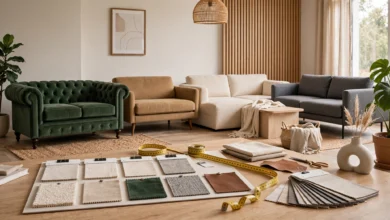
- Test the undertone in your actual room. Paint swatches look different under your lighting than they do in the store or online.
- Anchor with a neutral. Almost every enduring scheme is built around a neutral base, white, greige, cream, or warm gray, with color introduced through accents.
- Limit your palette to three tones. A dominant color, a secondary tone, and one accent shade keep a room cohesive without feeling busy.
- Consider your fixed finishes. Flooring, trim, and any built-in cabinetry should guide your color choice, since those elements are harder to change than paint.
- Think in decades, not seasons. Ask whether a color will still feel right in ten years, not just whether it’s popular right now.
For a deeper look at how undertones affect a finished room, Benjamin Moore’s guide to color theory is a useful reference before settling on a final shade.
15 Living Room Color Schemes That Never Go Out of Style
1. Warm White and Natural Wood
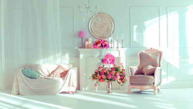
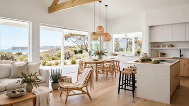
This is the most forgiving of all living room color schemes. A warm white wall (avoid stark, cool whites) paired with natural wood furniture and flooring creates a bright, airy backdrop that works with virtually any accent color you add later. It’s a favorite for open floor plans because it doesn’t compete with adjoining rooms.
2. Greige and Charcoal
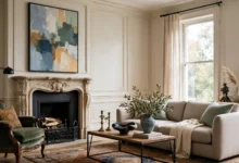
Greige, a blend of gray and beige, has remained popular for over a decade because it reads as neutral without feeling cold. Paired with charcoal furniture or trim, it creates a grounded, modern look that suits both traditional and contemporary homes.
3. Navy and Cream
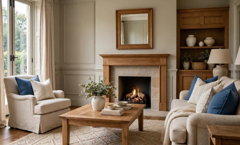
Navy blue walls or an accent wall paired with cream furnishings is one of the most enduring living room color schemes in traditional design. It reads as formal enough for a dining-adjacent living room but can be dressed down with linen textures and brass accents for a more relaxed feel.
4. Sage Green and Terracotta
This earthy pairing draws directly from nature, which is part of why it doesn’t date the way synthetic-feeling color trends do. Sage green walls with terracotta or clay-colored accents create a warm, organic living room that pairs well with rattan and wood furniture.
5. Black and White Contrast
A classic black-and-white scheme, whether through black trim, a black accent wall, or black furniture against white walls, has appeared in design for over a century. It’s dramatic without being trend-dependent and works equally well in modern and traditional spaces.
6. Camel and Denim Blue
Camel tones (think warm tan and light brown) paired with denim or slate blue create a masculine, lived-in feel that suits leather furniture and mid-century pieces. This combination has stayed consistently popular in both classic and modern interiors.
7. Soft Gray and Blush Pink
Gray walls paired with dusty pink or blush accents create a softer, more romantic version of a neutral living room color scheme. It’s a popular choice for rooms that get a lot of natural light, since the pink tones stay warm rather than looking washed out.
8. Deep Forest Green and Brass
Dark green walls paired with brass or gold fixtures create a rich, jewel-toned living room that has cycled in and out of trend cycles for decades without ever fully disappearing. It works particularly well in smaller rooms or reading nooks where a cozier feel is welcome.
9. All-White Minimalist
A monochromatic white scheme, walls, trim, and furniture in varying shades of white and off-white, is a staple of minimalist and Scandinavian design. Texture does the heavy lifting here: linen, boucle, and natural wood keep the room from feeling flat.
10. Taupe and Olive
Taupe walls paired with olive green accents create a muted, earthy living room color scheme that has grown especially popular as homeowners move away from cooler gray tones. It photographs well in both natural and artificial light, which helps explain its staying power.
11. Classic Beige and White
Simple, warm beige walls with crisp white trim remain one of the safest and longest-lasting choices for a living room. It’s an easy backdrop for colorful art, patterned rugs, or seasonal decor changes without ever needing to be repainted.
12. Slate Blue and Warm Gray
This cooler pairing suits north-facing rooms that need a little visual warmth despite limited direct sunlight. Slate blue walls with warm gray furniture strike a balance that feels calm without veering cold.
13. Cream and Chocolate Brown
Cream walls paired with deep chocolate brown furniture or trim create a warm, grounded living room color scheme that has remained a design staple since the mid-century era. Adding brass or wood accents keeps the pairing from feeling heavy.
14. Dusty Blue and White
A softer alternative to navy, dusty or powder blue paired with crisp white trim creates a coastal-adjacent look that works well beyond beach houses. It’s especially popular in living rooms that also serve as a reading or relaxation space.
15. Warm Gray and Terracotta
Closing out the list, warm gray walls paired with terracotta accents combine the neutrality of gray with the warmth of clay tones. It’s one of the more contemporary entries on this list, but its natural, earthy foundation gives it the same staying power as the more traditional pairings above.
Common Mistakes When Choosing a Living Room Color Scheme
Even a well-researched palette can fall short if a few basics are overlooked:
- Skipping the sample stage. Always test a swatch on your actual wall and view it at different times of day before committing.
- Choosing color before furniture. If you already own major furniture pieces, choose a wall color that complements them rather than starting from scratch.
- Overloading the palette. More than three primary tones in one room can start to feel chaotic rather than curated.
- Ignoring the finish. Matte, eggshell, and satin finishes all reflect light differently, which affects how a color reads once it’s on the wall.
- Forgetting the ceiling. An overlooked ceiling color can throw off an otherwise well-planned scheme; when in doubt, a soft white keeps things balanced.
For homeowners weighing finish options alongside color, Sherwin-Williams’ paint finish guide is a helpful resource for understanding how sheen affects the final look of a room.
Final Thoughts
Choosing among living room color schemes doesn’t have to mean chasing the latest trend or gambling on a bold shade you might regret in a year. The 15 palettes covered here, from warm white and natural wood to deep forest green and brass, have remained popular for a reason: they’re flexible, they flatter natural light, and they pair easily with furniture and accessories you already own or plan to add later. Whether you lean toward a soft neutral base or a richer, more saturated combination, the most successful living room color schemes share the same foundation: a dominant neutral, a considered accent, and enough restraint to let the room breathe. Pick the palette that fits how you actually live in the space, and it should look just as good a decade from now as it does the day you paint it.